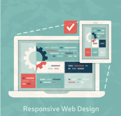
In January 2015, ClickZ analyzed web search data for the period of June to November 2014 and found that for Google, mobile comprised 48% of visits and desktops 52%. Futhermore, in November the scales tipped as mobile traffic finally surpassed desktop usage. It is more important than ever for companies to make sure their site is using responsive web design for mobile, tablets and video game consoles, but that’s not all responsive design can do.
The complexities of designing for multiple devices is mind-boggling. If you care to read about how designers do it, see this post from Ethan Marcotte. Responsive design typically means having one domain for all devices – getting rid of “m.site.com” sites – and for mobile, the original content is stacked into one column. Even with this solution, there are still plenty of problems with mobile-friendly translation, such as how to handle large images and how to take advantage of unique features of mobile and other devices, instead of just rearranging content for them.
Translating web design to mobile and other devices is the least interesting of what is possible for evolution of the Internet. What’s really exciting are advances in design that display personalized content and interactive experiences.
Personalized Web Content
The HubSpot COS (Content Optimization System) allows visitors that have self-identified by registering for your site – e.g. by downloading an eBook – to see content that is predetermined to be useful to them based on their buyer persona, being a member of one of your lists, or lifecycle stage (prospect vs. customer). If not registered, content can be shaped around whether they are a first-time or repeat visitor, Country, Device, or Referral Source. This is called “smart content,” and is available to Professional and Enterprise customers. In addition to smart content, the COS allows for website personalization tokens, such as identifying the person by name or title, e.g. “Hi, Brian,” when they go to the site. To see responsive web design examples go to the HubSpot inspiration page here.
Many sites are built on the WordPress platform and utilize custom or purchased themes that are responsive to mobile, tablet or desktop computers. This site is built on a WordPress responsive theme with the HubSpot plug-in. In the long-run this site will be fully moved over the COS platform, but for now we are taking the approach of partially integrating our WordPress Site with HubSpot.
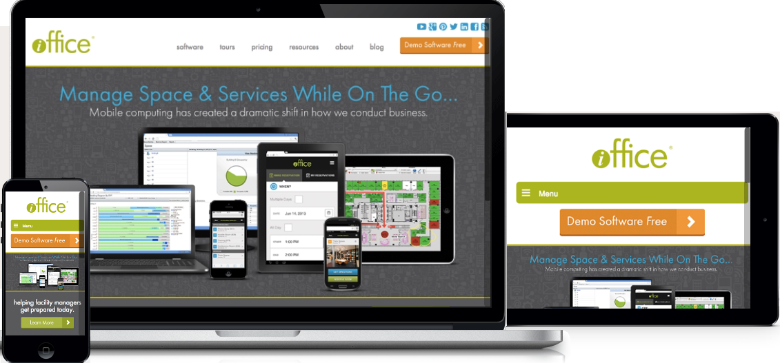
Example of Responsive Design for Desktop, Mobile and Tablet
Interactive Web Experiences
Some of the more interesting websites are taking advantage of both responsive and interactive design.
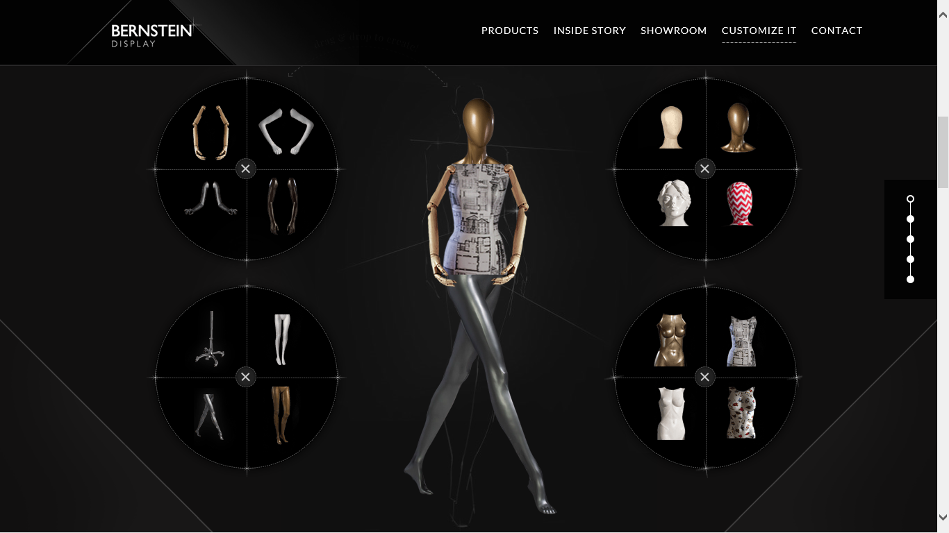
BersteinDisplay offers custom retail merchandising displays to high-end fashion stores. Their new website incorporates responsive design for mobile devices and an interactive “Customize It” mannequin, where visitors can drag and drop mannequin parts from a selection of options. The interactive mannequin sends the message about their Hydro-Graphics technology, where any digital image, fabric or metal finish can be applied directly to a mannequin in the manufacturing process.
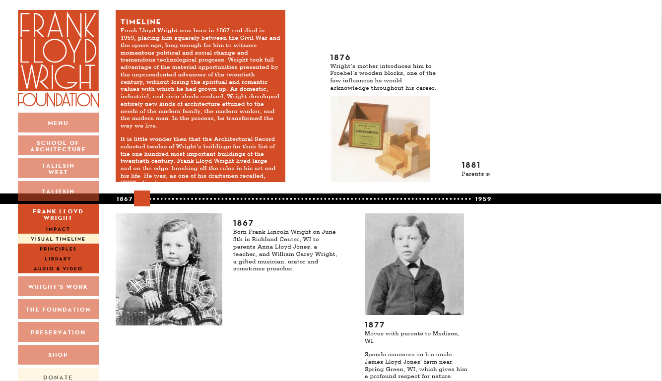
The new Frank Lloyd Wright website features a complete, searchable list of Wright’s more than 500 building designs and interactive elements, like a timeline of his life and an interactive map of his studio at Taliesin West, the foundation’s headquarters. The site also uses a Wright-inspired color palette and typeface.
Coda Story offers a prototype of a coming interactive way of viewing crisis news, which places stories onto a timeline called a “current,” so that when something major is happening we can see how it came about and what happened over months and even years. Their prototype using the Ukraine uprising has already won awards before the site has even launched, planned for later this year.
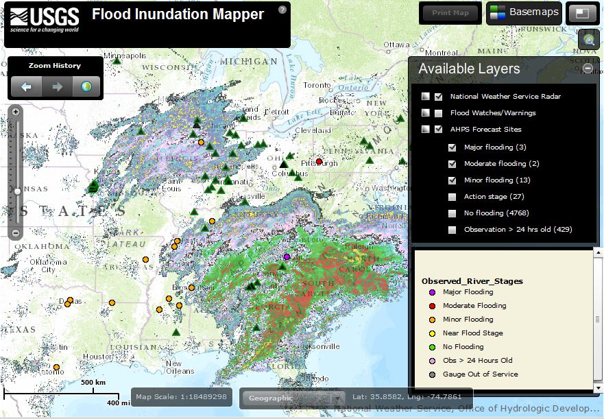
The U.S. Geological Survey has just released an interactive website showing real-time flood risk for rivers and streams across the U.S., using information by the National Weather Service (NWS).
Have you seen any great responsive or interactive designs that you want to share? Tell us in the comments below! We’re always looking out for great design inspiration!
If you don’t have in-house resources to convert your website over to a responsive design, contact us to talk about how we can help.
%CODE_subscribe%